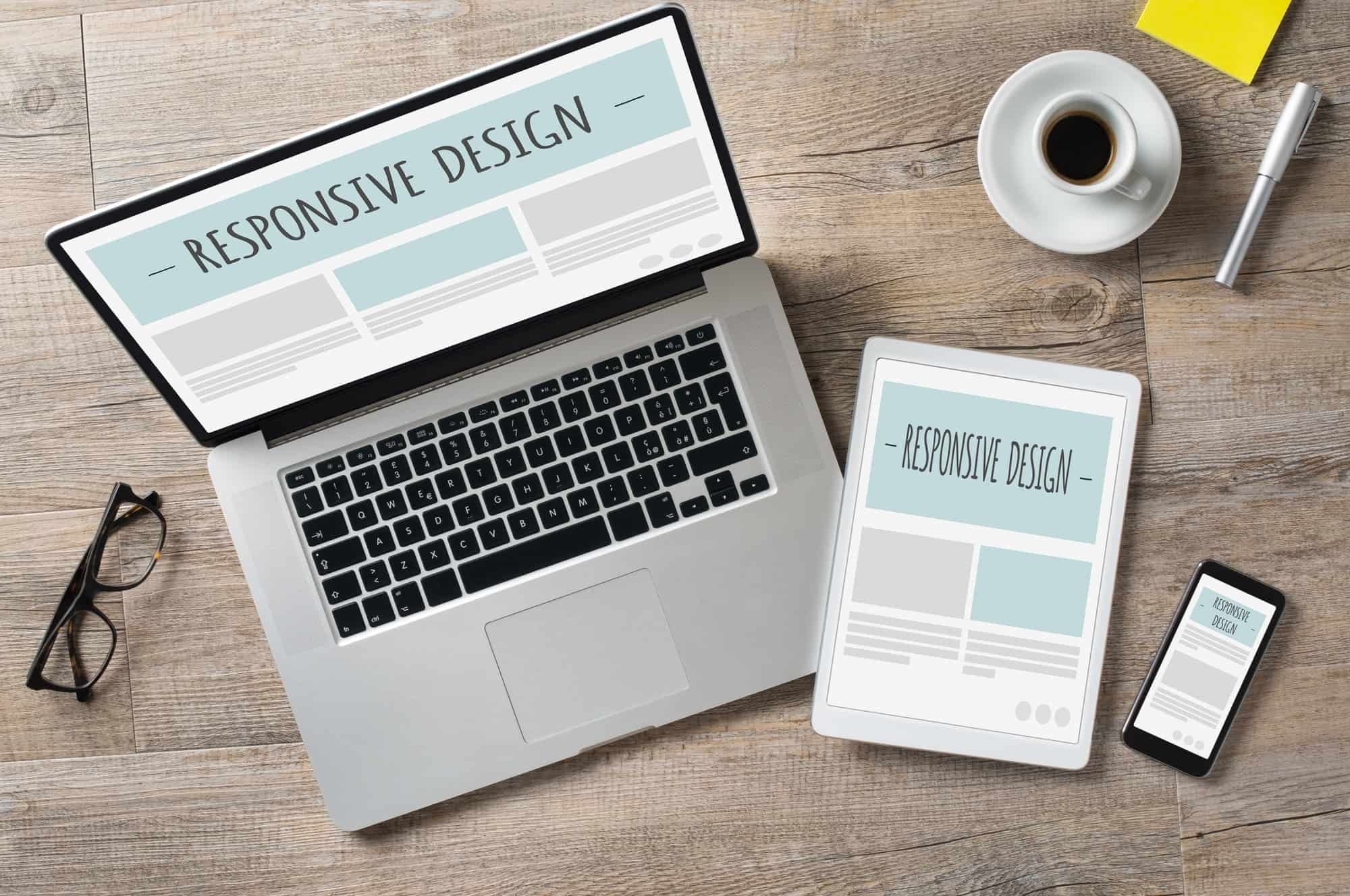
A responsive website design for your Puyallup, WA business allows you to design your website once so its appearance is optimized for the different screen sizes like desktop, tablet and smartphone.
In the past, most website design was done for a desktop or laptop computer monitor. When smartphones and tablets appearance, mobile web browser would show the website but you would have to zoom in and out to see the website contents. People started developing separate mobile websites but this doubled the amount of work to maintain your website.
A breakthrough came when website designers started changing the website formatting dynamically depending on the size of the screen viewing the website. This allows the content to change to fit the screen. Other element could have their sized changed or not even be shown.
You should use responsive website design because it allows you to only have one design for your website. This means you don’t have to build two websites with one being dedicated to mobile screen sizes. This reduces the amount of effort to maintain your website.
In fact, you should design with a “mobile first” strategy. For many websites, most people are viewing the website on a smartphone. Thus, that screen size should be designed as the priority. Then, confirm the website looks good on a larger screen size.
To summarize, you should design a website for your Puyallup, WA business to be responsive so you can develop just one set of content and change the website appearance based on the screen size.